Friday 25 October 2013

Modern and Stylish Stairs

In a residence of two floors, the stairs can mean a brilliant detail in the decor. Besides being of fundamental importance to the flow of traffic in the hoouse, they work as a mechanism for confirmation of personal style and the architectural work. As functionality and modernity are trends in decoration, selected models of stairs contemporary and stylish.
Suspended ladders have been shown to bet many architects, especially those who still offer a multifunctional feature, such as a bookcase, for example.


Use stairs as bookshelves, in fact, is an idea that has been more usual. Projects based on this type of model guarantee a contemporary and functional at the same time cozy. Stairs in this style create a space with a touch of home, intellectual.

The more modernist and minimalist proposals, with focus on metal structures, forme a zigzag or simply adorning the environment differently. The elegance of this type of ladder is the simplicity of its lines.


The stairs that merge with other details of the house contrasting materials also appear as a bet of architects and interior designers. The mixture of concrete and wood or just wood is the main focus of this model.


Hope u'd enjoyed!

xx
Hivena

Monday 23 September 2013

Balcony


The balconies used to be seen as the part of the house that made the transition between the inside and outside (the garden), today is a living space of social coexistence and family. The dimensions have increased and integrated to it other functions such as grills and gourmet cuisine, making life easier for those who like to receive this environment so yummy!

I selected some pictures of balconies of houses and apartments with really cool ideas for y'all take advantage!

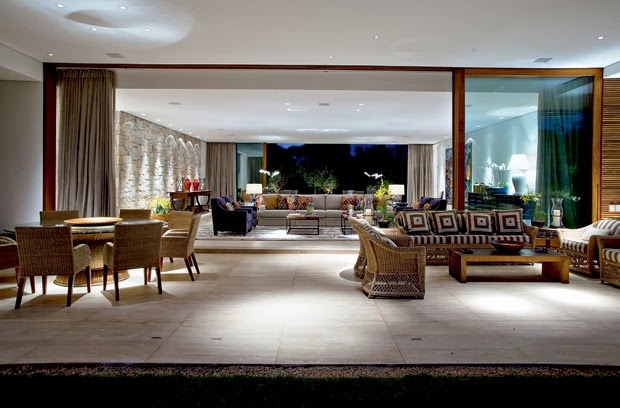
Balcony extensive and well integrated with the living room through the sliding doors, which open enough. The rattan furniture are nice and always a great choice for outdoor areas (covered). Via Casa Vogue.
 
 
Balcony integrated with barbecue and warmly decorated in blue and white, with wood and natural fiber. Project Yeda Garcia, Cesar Edgard photo via Design Annual.

 
This balcony appears to be an oasis in the city! The plants are potted and are practical effect. How not received closure glass, the furniture should be suitable for outdoor use. Via Home and costruction.
 
 
I hope u'd enjoyed!
xx
Hivena


Wednesday 24 July 2013

Black Kitchens

Most people think that kitchens must have finished well clear to give the feeling of cleanliness. But the dark finishes are sophisticated and work very well in both kitchens for day-to-day as the gourmet.
The bench is one of the most important elements of the kitchen, because it can not absorb fat and should be easy to clean. At this point the black granite takes advantage is more beautiful than the clear and stained, and cheaper than synthetic stones such as Silestone.
Using black in countertops, cabinets, floors or walls requires rather a whim extra planning the lighting, so that it is bright and beautiful as the following examples.
Fully integrated with the living room, the kitchen countertop and cabinets combines black with wooden clubs - only valid option for kitchens seldom used in day-to-day. But the result is beautiful!

Here the rustic burnt cement wall contrasts with the modern design of the cabinets. I liked the cabinet bottom that houses the furnace on one half and the adornments and cookbooks in the other.

Floor light counter tops and cabinets + black + wood details, love this combination because the clear floor doesn't leave the environment darken and the wood leaves the modern black cozier.


 Although small, this kitchen was beautiful and bright. The floor is gray porcelain tile, countertop and wall granite, glass cabinets and formica and back wall coated glass inserts, all in shades of black blending textures. The main lighting was done with a central groove and fluorescent lamps.


Kitchen-shaped "U" with clear floor, countertop and wall black granite, cabinets white glass and wood table. To disguise the taps on black background could have been used a black finish for boxes. Another idea is to take down the cabinet, not the wall!

Beautiful kitchen with integrated mix of textures in shades of gray and black and yellow details. The refrigerator is a show, right? The counter which divides the space tablets was coated with black glass and extends a little forming a table. I also loved the detail recessed lighting on a plank of wood following the counter.

Hivena

Monday 22 July 2013

Shelves

A beautiful shelf can be the highlight of the decoration of an environment, it needs to be proportional to the size of the environment and have the finish in harmony with the rest of the furniture. Furthermore, the type of use can influence in its design - it will be set up just for decorative objects or serve to organize the house (store many books, for example), because you might need some modules closed to hide the mess .


Wooden bookshelf with large rectangular niches + recessed lighting. To make access more convenient, a ladder completed the furniture that holds many books and objects.

Wooden bookcase with rugged design forming niches of various sizes + some parts with black background. I loved the effect of lighting on the ceiling!

Wooden bookcase with large niches of various formats that have room for wineries (note that the base of the shelf is higher).

Wood bookcase with two sizes of square niches + recessed lighting.

Bookshelf beige lacquer with niches of various sizes + parts + closed + recessed lighting mirror on the sides.

Bookcase gray with niches large square mirror + background + some parts closed doors with the same finish.

Bookshelf lacquer gray with irregular niches open and closed. I love the effect of the shelf and the side walls in the same finish, forming a box idea.

White bookshelf with niches of various sizes and with different depths + colored objects.

Bookcase with niches 4 different colors: blue, gray, black and white + modules of different sizes + bottom closed. I loved this one!

NOTE: As with most shelves with recessed lighting lamps are installed in wood, it is necessary to leave a wiring still waiting on the wall during construction, with an ignition switch, so when the cabinet is installed just make the connection.

Thursday 11 July 2013

Photos in Decor

I am the type of person who loves to travel and in my travels always take a lot of photos that always end up in the bottom drawer, or lost by the computer. So I decided to do a post explaining how we can use these photos in the decoration of the house, without giving that air of grandma's house.
Beautiful pictures can be turned into tables, a great resource for give personality to the decor of any room without spending a lot.


Use creativity to choose the theme, the more personal the better! You can enhance your clicks (instagram feelings), your unforgettable moments or acquire images that match you and your home. The frames should be simple so that the images stand out. Get inspired by these beautiful ideas!


The colorful pictures stood out in the wall covered with wood, I loved the effect!

Huge frames occupy the whole wall. The middle frame is in another room, but alignment with the door leaves the impression of closeness.

A huge photo printed on glass, valuing the wall headboard. The sepia tone combined with the decor in beige, brown and wood.


Perfect room! White floors, textured walls and wooden furniture. I like the effect stripped of frames supported on the shelf, so to modify the arrangement gives always!

Frames in composition always value the walls. The photos in black & white decorate elegantly and value both light backgrounds like the dark.

I love maps and loved this idea to frame the composition in the city map!

The photos of the NY skyline traverse all the walls, giving the feeling of being a true opening. Loved it!

                         Huge photos and black & white that fill the walls without regret decoration

Another beautiful picture of the NY skyline, which stood in the environment all pale.

I love the combination  detailed images of the famous buildings of NY. Images, simple at the beginning, were highly valued by the frame with paspatour gray. It proves that a simple idea can become sophisticated from a good idea!

Beautiful sequence of photos showing the movement of the wave. Moreover, the colors match the decor in blue and white, which refer to the beach weather. Perfect!

Decorating with neat photos in various sizes on the background wallpaper.

Black & White on wooden background or color on the clear wall  - both effects are gorgeous!

Several cool ideas for using the photos in a creative and leaving the environment more elaborate and cozy!
I hope you'd enjoyed!

Hivena


Wednesday 10 July 2013

Small Apartments

According to Wikipedia: Studio apartment  is a suite of small proportions, usually formed by only two rooms: a living room-bedroom-kitchen and a bathroom, both with a extremely small space.

Even if it is XS size, your home should meet your routine and look like you. There is no miracle and no fixed rule. Do you think that white walls extend? Yes, but a black wall is not prohibited. Understand?! List your priorities, look at your space and note the proportion. If there is anything that DOES NOT FIT  you'll have to leave for your next home ... that will be bigger! #goodfeelings

Integrated rooms, multifunctional furniture, organization, light colors, natural light, bespoke joinery, mirrors ... are items that can help you and make a few square meters surrender a lot! I made a selection of beautiful apartments, get inspired ...

1 In this duplex apartment, the room is integrated with the kitchen and is finished in light colors, a beautiful mix of white and gray + light and modern furniture.

2  Apartment with living room and kitchen integrated, which increases the feeling of spaciousness. But remember: in these cases, the kitchen has to be beautiful and well cared for! 

3  Apartment in darker shades, finishes modern + design furniture+ well lit. The striped rug, even with sober tones, gave life to the environment! 

4 Apartment colorful and feminine with prints in pink, purple and violet. The bookcase wood and white lacquer was beautiful!

5  Living room with integrated kitchen, but can be isolated by large mirrored sliding doors.

6  Kitchen is integrated with the living room. The wall was coated with a hollow wooden panel, which rests against the table, freeing up more space for circulation.

7  Among the room and kitchen, a wooden partition slatted hides without isolating totally, and still serves of support for the tv. Observe that the floor of the rooms are different and stood great!

8  The apartment with living room and integrated kitchen, in the bedroom there is a glass partition with printed film that tapped stripped to the project!

9  Kitchenette with white trim and dark wood. The tv is a rotating panel that can be seen from all angles.

10  Fully integrated, in this kit is only bedroom is separated by a partition made ​​of aluminum, which serves as a shelf on the other side to the room. 


11 Apartments with modern decor in shade of white and blue + design furniture + well planned lightning + mirror to enlarge. The division between the room and the room was cleaned to a bookshelf leaked modules diagonally super different!

12  To expand the apartment of 32 m² were used mirrors on the walls + mobile leaked. Same idea of the previous project, the shelf extends leaked since it divides and unites environments simultaneously. The TV has a swivel base and can be used in the living room or bedroom.

13  This project, though small, has several super modern ideas: mix of furniture in white + yellow + wood + well lit (as pententes Tom Dixon on the table) => small, colorful and modern!

14  A glass partition "separating" the lounge and bedroom at this kitchenette. Another interesting solution to save space is the table with bench against the wall. Loved the lighting!

15  Another colorful flat: white and orange are the base of the decoration, which is lightweight and stripped with parts super current. 

16 Basic Kitchenette with light wood floors + white walls. The difference is due to the modern design pieces.
17 Small apartment and female, all white decor + pastels. This is really small! The bed is actually a sofa bed and the cabinet side is all that is necessary, adapting himself according to the use.

18 Apartment with partitions between rooms but no doors, which still leaves the larger space. Note that only the area of the room was different with the walls in blue ink.

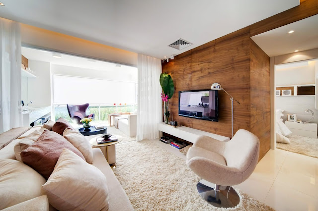
19 This is small but has a super balcony, which was the length of the room. A wall of tv prominence with gorgeous wood panel.

20 Another beautiful modern design and integrated whole, with clear and mirrored parts, like the wardrobe that has mirror door.